Examples |
ASP.NET Developer's Guide
- Getting Started
- Applying Stylesheet
- Using Asset Manager Add-on
- Advanced Settings
- Extending the Editor
- Toolbar
- Configuring the Toolbar Buttons
- Adding Custom Buttons
- Using Tabbed Toolbar
- Tag Selector Settings
- Localization
- FAQ
VI. Toolbar
VI.1. Configuring Toolbar Buttons
By default, the editor is configured to use tab toolbar. To configure the editor to use traditional toolbar:
<editor:wysiwygeditor
Runat="server"
scriptPath="scripts/"
UseTab="False"
ID="oEdit1" />
You can show/hide toolbar buttons using 2 ways:
-
By setting true/false to the appropriate properties. For example, this will show the "Clear All" button:
<editor:wysiwygeditor
Runat="server"
scriptPath="scripts/"
btnClearAll=true
ID="oEdit1" />
The "Clear All" button is disabled by default.
As seen on the above example, to enable/show the "Clear All" button, we set
btnClearAll property to true.
Please Note that some toolbar buttons are disabled by default.
Please refer to the button list at the end of this section.
- By specifying the name of the buttons you'd like to display using
ButtonFeatures property.
Using the ButtonFeatures property, you specify also
the button ordering, as well as
button spaces and toolbar line breaks. Below is an example:
oEdit1.ButtonFeatures = New String() { _
"FullScreen","Preview","Print","Search", _
"Cut","Copy","Paste","PasteWord","PasteText","|", _
"Undo","Redo","|","ForeColor","BackColor","|", _
"Bookmark","Hyperlink","XHTMLSource","BRK", _
"Numbering","Bullets","|","Indent","Outdent","LTR","RTL","|", _
"Image","Flash","Media","|", _
"Table","Guidelines","Absolute","|","Characters","Line", _
"Form","RemoveFormat","ClearAll","BRK", _
"StyleAndFormatting","TextFormatting","ListFormatting", _
"BoxFormatting","ParagraphFormatting","CssText","Styles","|", _
"Paragraph","FontName","FontSize","|","Bold","Italic", _
"Underline","Strikethrough","|", _
"JustifyLeft","JustifyCenter","JustifyRight","JustifyFull"}
Note:
Use "|" for Space Break and "BRK" for Line Break.
The result is shown below:

For a list of button names, please refer to the button list below.
List of buttons (includes also menu items & dropdowns):
| Icon |
Description |
Name |
Property |
Default Value |
IE* |
Moz* |
 |
"Save" button. |
Save |
(No Property)
This butttom will automatically enabled if you specify the
onSave property.
More info
|
false |
Yes |
Yes |
 |
"Full Screen" button. |
FullScreen |
btnFullScreen |
true |
Yes |
Yes |
 |
"Preview" button. |
Preview |
btnPreview |
true |
Yes |
Yes |
 |
"Print" button. |
Print |
btnPrint |
false |
Yes |
Yes |
 |
"Search" button. |
Search |
btnSearch |
true |
Yes |
No |
 |
"Spell Check" button. |
SpellCheck |
btnSpellCheck |
false |
Yes |
No |
 |
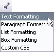
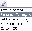
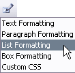
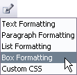
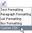
"Style & Formatting" button.
This button opens a menu which has:
- "Text Formatting" menu item
- "List Formatting" menu item
- "Box Formatting" menu item
- "Paragraph Formatting" menu item
- "Custom Css" menu item
|
StyleAndFormatting |
(No Property)
This button is enabled by default as well as the menu items:
- "Text Formatting" menu item
- "List Formatting" menu item
- "Box Formatting" menu item
- "Paragraph Formatting" menu item
- "Custom Css" menu item
If you disabled all the above menu items (by setting btnTextFormatting, btnListFormatting,
btnBoxFormatting, btnParagraphFormatting and btnCssText properties to false, this button would automatically
disabled.
If you're using ButtonFeatures property,
you can show/hide this button by including or not including the button name "StyleAndFormatting"
in the ButtonFeatures property value.
You'd also need to include at least one of its menu items
("TextFormatting", "ParagraphFormatting", "ListFormatting",
"BoxFormatting", "CssText") in the ButtonFeatures property value.
|
- |
Yes |
Yes |
 |
"Text Formatting" menu item. |
TextFormatting |
btnTextFormatting |
true |
Yes |
Yes |
 |
"Paragraph Formatting" menu item. |
ParagraphFormatting |
btnParagraphFormatting |
true |
Yes |
Yes |
 |
"List Formatting" menu item. |
ListFormatting |
btnListFormatting |
true |
Yes |
Yes |
 |
"Box Formatting" menu item. |
BoxFormatting |
btnBoxFormatting |
true |
Yes |
Yes |
 |
"Custom Css" menu item. |
CssText |
btnCssText |
true |
Yes |
Yes |
 |
"Cut" button. |
Cut |
btnCut |
true |
Yes |
CTRL-X |
 |
"Copy" menu item. |
Copy |
btnCopy |
true |
Yes |
CTRL-C |
 |
"Paste" button. |
Paste |
btnPaste |
true |
Yes |
CTRL-V |
 |
"Paste from Word" button. |
PasteWord |
btnPasteWord |
true |
Yes |
Yes |
 |
"Paste Text" button. |
PasteText |
btnPasteText |
false |
Yes |
Yes |
 |
"Undo" button. |
Undo |
btnUndo |
true |
Yes |
Yes |
 |
"Redo" button. |
Redo |
btnRedo |
true |
Yes |
Yes |
 |
"Text Color" button. |
ForeColor |
btnForeColor |
true |
Yes |
Yes |
 |
"Text Background Color" button. |
BackColor |
btnBackColor |
true |
Yes |
Yes |
 |
"Bookmark" button. |
Bookmark |
btnBookmark |
true |
Yes |
Yes |
 |
"Hyperlink" button. |
Hyperlink |
btnHyperlink |
true |
Yes |
Yes |
 |
"Custom Tag" button. |
CustomTag |
(No Property)
This butttom will automatically enabled if you specify the
CustomTagList property.
More info
|
- |
Yes |
Yes |
 |
"Image" button. |
Image |
btnImage |
true |
Yes |
Yes |
 |
"Flash" button. |
Flash |
btnFlash |
false |
Yes |
Yes |
 |
"Media" button. |
Media |
btnMedia |
false |
Yes |
Yes |
 |
"Internal Link" button. |
InternalLink |
(No Property)
This butttom will automatically enabled if you specify the
InternalLink property.
More info
|
- |
Yes |
Yes |
 |
"Custom Object" button. |
CustomObject |
(No Property)
This butttom will automatically enabled if you specify the
CustomObject property.
More info
|
- |
Yes |
Yes |
  |
"Table" button. |
Table |
btnTable |
true |
Yes |
Yes |
 |
"Guidelines" button. |
Guidelines |
btnGuidelines |
true |
Yes |
No |
 |
"Absolute" button. |
Absolute |
btnAbsolute |
true |
Yes |
Yes |
 |
"Secial Characters" button. |
Characters |
btnCharacters |
true |
Yes |
Yes |
 |
"Horizontal Line" button. |
Line |
btnLine |
true |
Yes |
Yes |
 |
"Form" button. |
Form |
btnForm |
true |
Yes |
Yes |
 |
"Remove Formatting" button. |
RemoveFormat |
btnRemoveFormat |
true |
Yes |
Yes |
 |
"Source Editor" button for full HTML editing.
|
XHTMLFullSource |
(No Property)
If the Editor editing mode is set to "HTML" or "XHTML",
this button would automatically displayed.
If you're using ButtonFeatures property,
you can show/hide this button by including or not including the button name "XHTMLFullSource"
in the ButtonFeatures property value.
|
- |
Yes |
Yes |
 |
"Source Editor" button for HTML BODY content editing. |
XHTMLSource |
(No Property)
If the Editor editing mode is set to "HTMLBODY" or "XHTMLBODY",
this button would automatically displayed
(This this button is displayed by default as the Editor has default editing mode set to "HTMLBODY").
If you're using ButtonFeatures property,
you can show/hide this button by including or not including the button name "XHTMLSource"
in the ButtonFeatures property value.
|
- |
Yes |
Yes |
 |
"Clear All" button. |
ClearAll |
btnClearAll |
false |
Yes |
Yes |
 |
"Style Selection" button. |
Styles |
btnStyles |
false |
Yes |
Yes |
 |
"Paragraph" dropdown. |
Paragraph |
btnParagraph |
true |
Yes |
Yes |
 |
"Font" dropdown. |
FontName |
btnFontName |
true |
Yes |
Yes |
 |
"Font Size" dropdown. |
FontSize |
btnFontSize |
true |
Yes |
Yes |
 |
"Bold" button. |
Bold |
btnBold |
true |
Yes |
Yes |
 |
"Italic" button. |
Italic |
btnItalic |
true |
Yes |
Yes |
 |
"Underline" button. |
Underline |
btnUnderline |
true |
Yes |
Yes |
 |
"Strikethrough" button. |
Strikethrough |
btnStrikethrough |
false |
Yes |
Yes |
 |
"Superscript" button. |
Superscript |
btnSuperscript |
false |
Yes |
Yes |
 |
"Subscript" button. |
Subscript |
btnSubscript |
false |
Yes |
Yes |
 |
"Justify Left" button. |
JustifyLeft |
btnJustifyLeft |
true |
Yes |
Yes |
 |
"Justify Center" button. |
JustifyCenter |
btnJustifyCenter |
true |
Yes |
Yes |
 |
"Justify Right" button. |
JustifyRight |
btnJustifyRight |
true |
Yes |
Yes |
 |
"Justify Full" button. |
JustifyFull |
btnJustifyFull |
true |
Yes |
Yes |
 |
"Numbering" button. |
Numbering |
btnNumbering |
true |
Yes |
Yes |
 |
"Bullets" button. |
Bullets |
btnBullets |
true |
Yes |
Yes |
 |
"Indent" button. |
Indent |
btnIndent |
true |
Yes |
Yes |
 |
"Outdent" button. |
Outdent |
btnOutdent |
true |
Yes |
Yes |
 |
"Left to Right" button. |
LTR |
btnLTR |
false |
Yes |
Yes |
 |
"Right to Left" button. |
RTL |
btnRTL |
false |
Yes |
Yes |
*IE : Internet Explorer 5.5/later (Windows)
*Moz: Netscape 7.1/later, Mozilla 1.4/later & Firefox 1.0/later (Windows & Mac OS X)
VI.2. Adding Custom Buttons
To add custom buttons on the Editor toolbar, use ToolbarCustomButtons collection property
and specify the ButtonFeatures property to include the custom button names.
Below is an example:
oEdit1.ToolbarCustomButtons.add(_
New CustomButton("CustomName1", "alert('Command 1 here.')", "Caption 1 here", "btnCustom1.gif"))
oEdit1.ToolbarCustomButtons.add(_
New CustomButton("CustomName2", "alert('Command 2 here.')", "Caption 2 here", "btnCustom2.gif"))
oEdit1.ToolbarCustomButtons.add(_
New CustomButton("CustomName3", "alert('Command 3 here.')", "Caption 3 here", "btnCustom3.gif"))
oEdit1.ButtonFeatures = New String() { _
"FullScreen","Preview","Print","Search", _
"Cut","Copy","Paste","PasteWord","PasteText","|", _
"Undo","Redo","|","ForeColor","BackColor","|", _
"Bookmark","Hyperlink","XHTMLSource","BRK", _
"Numbering","Bullets","|","Indent","Outdent","LTR","RTL","|", _
"Image","Flash","Media","|", _
"Table","Guidelines","Absolute","|","Characters","Line", _
"Form","RemoveFormat","ClearAll","BRK", _
"StyleAndFormatting","TextFormatting","ListFormatting", _
"BoxFormatting","ParagraphFormatting","CssText","Styles","|", _
"Paragraph","FontName","FontSize","|","Bold","Italic", _
"Underline","Strikethrough","|", _
"JustifyLeft","JustifyCenter","JustifyRight","JustifyFull", _}
"CustomName1","CustomName2","CustomName3"}
As seen on the above code, you need to set the CustomButtons property with CustomButton object.
CustomButton has the following properties:
- Name, button name
- Action, command to execute
- Tooltips, tooltips text
- Icon, image/icon
(You'd need to create your own image or you can use the provided
btnCustom1.gif – btnCustom7.gif)
You can re-arrange the custom buttons at any position on the toolbar by setting the ButtonFeatures property.
VI.3. Using Tabbed Toolbar
You can organize the toolbar into tabs and groups by specifying ToolbarTabs
collection property. In each tab there are groups of buttons. Below is the example:
Dim grpEdit = new ISGroup("grpEdit", "", _
New String() {"Undo", "Redo", "Search", "ClearAll", "BRK", _
"Cut", "Copy", "Paste", "PasteWord", "PasteText", "RemoveFormat"})
Dim grpFont = new ISGroup("grpFont", "", _
New String() {"FontName", "FontSize", "BRK", "Bold", "Italic", _
"Underline","Strikethrough","Superscript","Subscript", "ForeColor", "BackColor"})
Dim grpPara = new ISGroup("grpPara", "", _
New String() {"Paragraph", "Indent", "Outdent", "LTR", "RTL", "BRK", _
"JustifyLeft", "JustifyCenter","JustifyRight","JustifyFull", "Numbering","Bullets"})
Dim grpPage = new ISGroup("grpPage", "", _
New String() {"Save", "Print", "Preview", "BRK", "FullScreen", "XHTMLSource"})
Dim grpObjects = new ISGroup("grpObjects", "", _
New String() {"Image", "Flash","Media", "CustomObject", "BRK", _
"CustomTag", "Characters", "Line"})
Dim grpLinks = new ISGroup("grpLinks", "", _
New String() {"Hyperlink","InternalLink", "BRK", "Bookmark"})
Dim grpTables = new ISGroup("grpTables", "", _
New String() {"Table", "BRK", "Guidelines"})
Dim grpStyles = new ISGroup("grpStyles", "", _
New String() {"StyleAndFormatting", "Styles", "BRK", "Absolute"})
Dim grpCustom = new ISGroup("grpCustom", "", _
New String() {"CustomName1", "CustomName2", "BRK", "CustomName3"})
Dim tabHome = new ISTab("tabHome", "Home")
tabHome.Groups.AddRange(New ISGroup() {grpEdit, grpFont, grpPara, grpPage})
oEdit1.ToolbarTabs.add(tabHome)
Dim tabStyle = new ISTab("tabStyle", "Objects & Styles")
tabStyle.Groups.AddRange(New ISGroup() {grpObjects, grpLinks, grpTables, grpStyles, grpCustom})
oEdit1.ToolbarTabs.add(tabStyle)
The ISTab object has the following properties:
- Id, id of tab
- Text, tab text/name
- Groups, collection of ISGroup
The ISGroup object has the following properties:
- Id, id of tab
- Text, group text/name
- Buttons, array of button name
The result is shown below:

VI.4. Tag Selector Settings
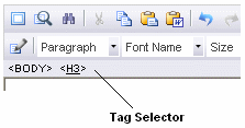
You can move the Tag Selector at the top of the editing area (below the Editor toolbar)
by setting the TagSelectorPosition property to "top".
Below is an example:
<editor:wysiwygeditor
Runat="server"
scriptPath="scripts/"
TagSelectorPosition="top"
ID="oEdit1" />
The result is shown below:

To hide the Tag Selector, set UseTagSelector property to false.
<editor:wysiwygeditor
Runat="server"
scriptPath="scripts/"
UseTagSelector=false
ID="oEdit1" />
© 2008, INNOVA STUDIO (www.innovastudio.com). All rights reserved.


